Note: I am not an expert on this topic, but I thought the information I came across was worth sharing.
Before we get started, we need to understand what hue, hint, shade, and tone means:

I found this webpage (source of image above) to be helpful in understanding the differences. Basically, hue is the basic colour wheel. Add white and you get tint, add black and you get shade, and add grey (black and white) and you get tone. Now let’s actually take a look at some of the current seasons’ anime:

First up is Maid Dragon from Kyoto Animation, which mostly uses hues and tints. I noticed that this series is extremely colourful, as almost every scene contains ROYGBIV (colours of the rainbow). If you look at the scene below, the background is actually a rainbow gradient that complements with the characters’ hair colours.

As you can see, this is a huge contrast to Urara Meirochou, from J.C.Staff, which mostly uses tones. On top this, there’s a certain filter on the colours that tones down the lighting (I said before that the series has an “earthy” feel). Urara also uses a lot of patterns (not pictured) which makes for a nice presentation.

Now let’s take a look at Demi-chan, from A-1 Pictures. This series is a mix of hue and shade (maroon and deep green), apart from the tint for the blue flame. This along with that fact that the show has minimal use of gradients gives the series a certain flatness.

The last example is from Gabriel Dropout, from Doga Kobo. The colours might look similar to Demi-chan but Dropout uses tints (especially in the hair) which makes it noticeably brighter.
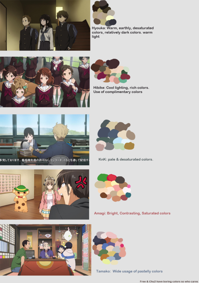
I found the following breakdown on the internet somewhere. All the anime are from Kyoto Animation:
Although this is all pretty interesting, this is about all that I can offer on the subject. If you want to learn more, here is a Pinterest board that has a lot of inforgraphics on colour, such as ones on the psychology of colour.
Speaking of colours, though, I’m going to mention some of my favourite music videos. I’ve always liked cmyk (cyan, magenta, yellow, and black) used in music videos because it makes the scenes look dazzling and surreal at the same time:
Big Sean – Bounce Back

Big Sean – Moves
Rae Sremmurd – By Chance

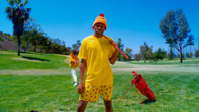
Next, Tyler, The Creator is known for his bright and saturated pastel colours in his music videos:
Tyler, The Creator – IFHY

Tyler, The Creator – Tamale
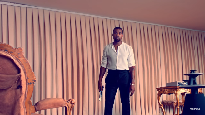
And although I don’t really know how to describe the colours for this one but I really like the colour palette on Kanye West’s Runaway as well:
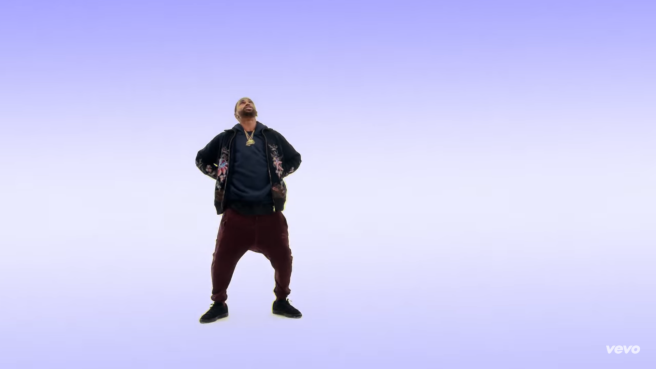
And of course, Drake’s Hotline Bling has some really pretty colours too:

Lights and sounds are so interesting. The fact that they both behave as waves, the fact that this property allows them to interact with our physical environments in predictable yet beautiful ways, the fact that our bodies have organs that can detect these vibrations in meaningful ways, and the fact that we use this as a medium to create art… it’s mind-blowing. Just how cool is that this is the world that we exist in? And we associate and express our emotions through lights and sounds, even thought we only have access to a fraction of the whole spectrum. I wonder just how much unseen and unheard things are out there. I wonder what God can see and hear.
[Sources]
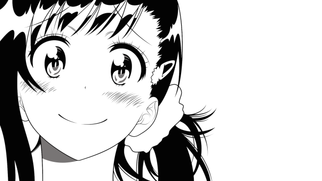
Image is of Kosaki Onodera from Nisekoi by Co1onel
Credit goes to /u/Chariotwheel and /u/Takana_no_Hana for providing the discussion on r/anime.

Thanks for sharing images. I don’t understand in first half but after see that comparison pic, it’s very useful. :3
LikeLike
You’re so welcome! Thanks for reading, I’m glad you found it useful 🙂
LikeLike